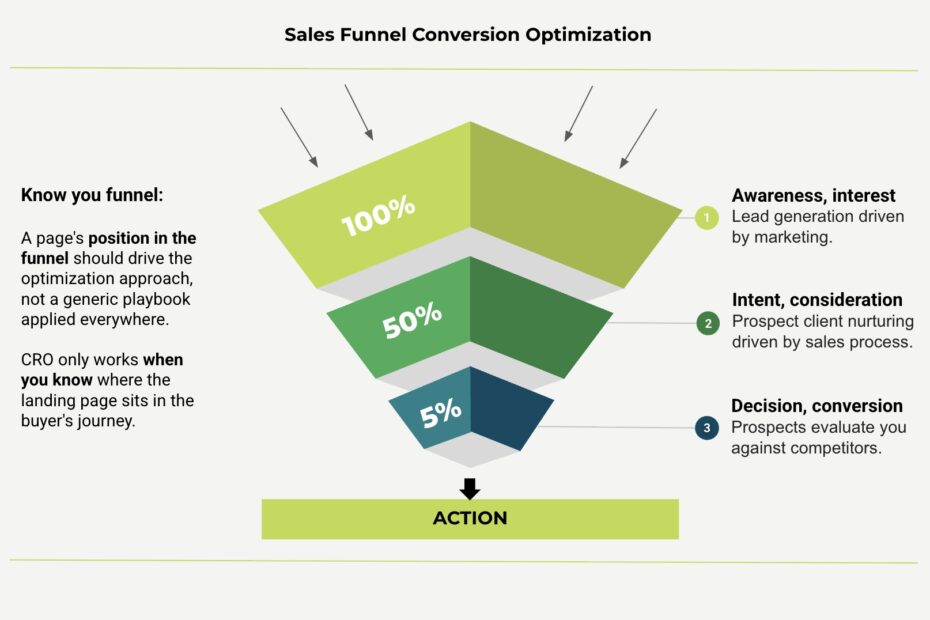
Conversion rate optimization only works when you know where a page sits in the buyer’s journey. A homepage, a comparison page, and a checkout page each need different content, different proof, and different calls to action. Because each one is talking to a visitor at a different level of intent. Optimizing a page without this context leads to changes that look good in isolation but do nothing for revenue.
The mistake that causes CRO efforts to fail
Most conversion rate optimization work starts with a symptom. For example, bounce rate is too high, page converts below benchmark, or traffic is up but revenue is flat. So the natural instinct is to fix the symptom directly: change the headline, swap the button color, shorten the form, add a testimonial, run an A/B test, or move on to the next page.
The problem is that this treats every page like it has the same job, but it doesn’t.
Let’s look at a few possible scenarios
- A visitor landing on a blog post has never heard of your brand.
- A visitor sitting on your pricing page has already decided you’re a real option and is comparing you to two or three competitors in another tab.
- A visitor abandoning a cart at checkout already wants to buy and is being stopped by something small, like an unexpected shipping fee or a confusing form field.
These are three completely different psychological moments, yet teams often apply the same optimization playbook to all of them.
That’s how the pages end up being “optimized”. A top of funnel blog post with hard sell language that scares readers away, or leaving a checkout page full of brand storytelling when the visitor just wants to finish the transaction and get their confirmation email.
The funnel stage changes everything about the page
Once you know where a page sits in the funnel, the right moves become obvious.
Top of funnel pages such as blog content, social landing pages, awareness campaigns, need to earn attention and trust. The visitor doesn’t know your product yet, so the job of the page is education and relevance, not a hard pitch.
This is a visitor who arrived with a question or a problem, not a purchase intent. They clicked through from a search result, a social post, or an ad because something caught their interest, but they have no context for who you are or why you’d be worth trusting yet. If the page responds to that moment with a sales pitch, a discount countdown, or a “buy now” button above the fold, it reads as pushy and out of step with where the visitor actually is. Trust gets built by being useful first: answering the question they came with, demonstrating expertise, and giving them a reason to believe you understand their situation.
Conversion here often looks like a newsletter signup, a resource download, or simply enough engagement that the visitor comes back. These are intentionally low commitment asks because a low commitment ask is what matches a low intent visitor. Pushing for a demo request or a sale at this stage usually backfires, since the visitor isn’t ready and the mismatch itself can damage trust before it has a chance to form. The metrics that matter most here are things like scroll depth, time on page, return visits, and email signups, not immediate revenue. A well optimized top of funnel page plants the seed for a sale that might not happen for weeks.
Middle of funnel pages, for example comparison pages, feature pages, case studies, or pricing are talking to a visitor who is actively evaluating. This is where proof matters most: specific outcomes, clear differentiation, honest answers to the objections a buyer is silently holding.
By the time someone reaches a pricing page or a “you vs competitor” comparison, they already know your product exists and are seriously weighing whether it’s the right fit. They are also very likely comparing you against two or three alternatives in other browser tabs at the same time. The page’s job is no longer to introduce your brand; it’s to resolve doubt fast enough that the visitor doesn’t need to go looking for answers elsewhere. Vague claims like “industry leading” or “best in class” do nothing at this stage, because a skeptical evaluator has heard that language from every competitor too. What actually moves someone is specificity: a named result, a before and after number, a detail about implementation that proves the product works the way it claims.
A visitor here needs confidence, not a broader introduction to who you are. This means the page should proactively answer the objections a buyer is unlikely to type into a contact form but is definitely thinking about: Is this going to be hard to set up? What happens if it doesn’t work for my use case? Is the pricing actually going to stay this way? Case studies, side by side feature breakdowns, transparent pricing structures, and FAQ sections that address real hesitations all do more conversion work here than another paragraph about company values. The goal of this stage is to get the visitor to a place where the decision feels safe to make.
Bottom of funnel pages such as checkout, signup, demo request, and contact forms are about friction removal. The visitor has already decided. Every extra field, vague label, or moment of doubt at this stage is pure lost revenue.
This is the most expensive place in the entire funnel to lose someone, because this visitor has already done the work of getting convinced. They clicked “buy,” “sign up,” or “request a demo” with genuine intent to follow through. Anything that slows them down at this point isn’t educating or building trust anymore, it’s just an obstacle between a warm lead and a closed conversion. An unexpected shipping cost that appears at checkout, a form asking for a phone number when only an email was needed, a confusing error message on a required field: these are the moments where high intent visitors quietly disappear, and they rarely come back to try again.
The optimization job here is subtraction: fewer steps, fewer distractions, fewer reasons to hesitate. This is the one stage where adding more content, more reassurance, or more options usually hurts rather than helps. A checkout flow doesn’t need a mission statement or a related products carousel. It needs to move the visitor from decision to done as directly as possible, with progress indicators if the flow has multiple steps, autofill wherever possible, and zero surprises about cost or commitment. Small, unglamorous changes, like removing an unnecessary form field or clarifying a confusing label, routinely produce some of the largest revenue gains in conversion optimization work, precisely because they’re acting on visitors who were already sold.
Run the wrong playbook on the wrong stage and you can improve a metric while actually hurting revenue. A cleaner checkout page might lift form completions while the business needed help further up the funnel, where the real drop off was happening. Without funnel context, teams optimize the page in front of them instead of the page that matters.
How this shapes the way we work at Digital 360 Hub
Before we touch a single button, headline, or layout, we spend real time understanding where each page sits in a client’s sales funnel and what job that page is actually supposed to do. This isn’t a formality. It’s the foundation everything else is built on.
For every client we take on, that means mapping the customer journey specific to their business: how traffic arrives, what a visitor typically knows or doesn’t know at each stage, where drop off is happening, and what a “win” actually looks like on that particular page. A SaaS company’s funnel looks nothing like an ecommerce brand’s funnel, and even within one business, a demo request page and a blog post are solving completely different problems.
We do this because generic best practices only get you generic results. A button color test or a headline swap might move a number slightly, but it won’t move revenue in a meaningful, lasting way unless it’s grounded in what that specific page needs to accomplish for that specific visitor at that specific point in their decision. Real conversion optimization comes from understanding intent first and design second.
This is also why our process starts with research and funnel mapping before any test goes live. We look at analytics, session recordings, and the actual paths visitors take through a site, then use that to identify which stage is genuinely underperforming and why. Only then do we start designing changes, because a change that works at the top of the funnel can actively hurt performance at the bottom, and vice versa.
What this means for your website
If your website has underperforming pages, the fix isn’t always more traffic, more design polish, or more A/B tests. Often it’s clarity about what each page is supposed to do and whether it’s currently doing that job for the visitor who’s actually on it.
At Digital 360 Hub, we turn underperforming websites into revenue engines by starting with that clarity, not skipping past it. Funnel context isn’t a step in our process. It’s the lens we use for every decision that follows.
If you’re ready to find out where your website is actually losing revenue, we’d be glad to walk through it with you.